Schaan (FL), September 28, 2017 – The Hilti Group has given its global brand image a makeover. The new corporate identity has a fresher, more dynamic impact and a greater focus on the customer.
Key issues of the new brand management concept, which has been developed in cooperation with internationally renowned agencies, are differentiation and customer focus. The design has become fresher and more dynamic. An extended color palette, based on the core color red, and new graphics elements ensure a vibrant, modern image. With new communication content, Hilti is emphasizing its concentration on the strengths that set it apart, such as direct customer contact, the dedication and passion of team members and the well-defined corporate culture.
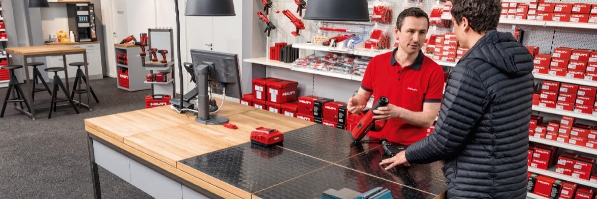
The new brand design will be implemented in stages and all Hilti global points of contact will have been adapted by the end of 2019. Implementation began with a revised internet presence which was rolled out in 40 countries simultaneously at the beginning of the year. In addition to a modern design, the content and functions were also improved. The restyling of the more than 700 Hilti Stores worldwide will also be carried out step-by-step. Special attention will be paid to optimized product demonstrations, visitor guidance and individual consultancy options. Traditional shop counters will be dispensed with and tablets and multimedia corners will be used; these are just a few examples from the new store concept. The new dynamics and the increased customer focus are also evident in the redesigned trade fair presence.
The brand as a value-adding factor
The approximately 15,000 sales team members worldwide will be supplied with a modern clothing line as part of the new brand image. The well-known red toolbox, a brand icon which often draws attention on building sites around the world, has also been restyled and equipped with new functions. It will gradually be launched onto the markets from 2018 onwards. However the trademarked elements, such as the company logo and the red color, have not been affected by the makeover.
Refreshing a well-established brand image is a complex matter. “We allowed ourselves a great deal of time for this sensitive task and, in numerous workshops, we integrated team members from all over the world into the project and got them on board,” explained Jessica Nowak, head of Global Brand & Communications at Hilti, commenting on the project. “At the end, the line was backed by everyone, which makes implementation within the organization easier. Our brand is a key value-adding factor for us and the new brand refresh makes it even stronger and more dynamic, placing it in line with our corporate strategy, ready for the future.”

